

IN AN EFFORT TO STAY CONNECTED WITH OUR MEMBER ARTISTS, WE THOUGHT WE WOULD VISIT THEIR STUDIOS AND SHARE A BIT OF THEIR WORK IN PROGRESS WITH YOU.
• TODAY WE FEATURE IRENE VANBUSKIRK •
When I first began to photograph seriously 7 years ago, I was concerned about sharpness, exposure, depth of field and composition. I still consider all those topics and more in my photography, but there comes a point when that becomes ALMOST second nature. I then searched for other ways to express my inspiration. This Work in Progress is about my ongoing progression into new way to produce art with my photography. It involves texture layers, some compositing using blend modes and masking. At first I used layers cautiously, maybe in the sky to make it interesting without being too obvious. I will begin with some photographs that I captured in Joshua Tree National Park. This was my first visit to the National Parks in the western part of the country and I was surrounded by trees and boulders. I looked for compositions that were compelling. Sometimes the skies were not as impressive and I decided to replace the skies with textures photographs of the boulders.

THE GRACEFUL RECLINE
What captured my attention in this image was the way the tree seemed to be gracefully reclining on the rock with the branch poised up, almost like the little finger of someone elegantly drinking from a tea cup. After editing the photograph in Lightroom (LR) I took it into Photoshop (PS) to use the texture layer for the sky. I often manipulate the texture layer before I use it - lighten, darken, soften it, use part of it, change the color, etc.
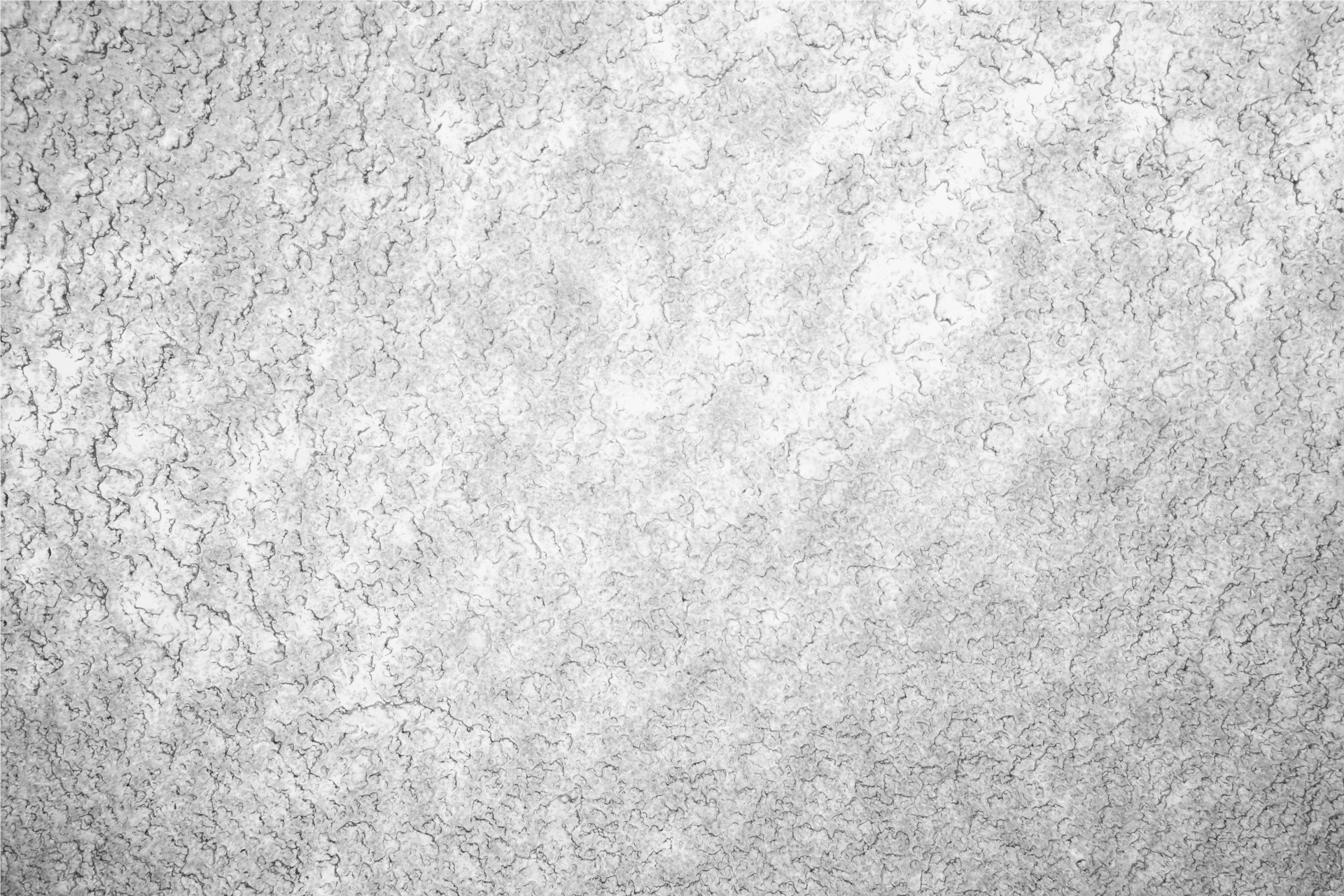
Stone texture for the sky in Graceful Recline.
LINES AND LIMBS Base Photograph

The yellow lines in the rock and the limb mirroring the lines caught my attention. My intent was to focus on nature’s art. Time and water had and rounded the rocks and softened their appearance. This tree, like many in the park, had been transformed into an eerie, captivating sculpture. I used texture in the sky and very lightly on the boulders.
I used the same sky texture in this image as I did in THE GRACEFUL RECLINE, but I also added some texture to the boulders and saturated some of the colors.


WINTER’S EVE base photo
After using texture to enhance the photographs captured in the national parks of the western part of the country, I decided to throw caution to the wind and play with textures in other images to give the image a different feel. I liked the base photograph of WINTER’S EVE, but I wanted it to have a warmer feel and be a little unusual. It's a case of trial and error until I find just the right feeling. Sometimes I try five or six textures until I find just the right feeling. It is a process.

The texture I used for the sky in WINTER’S EVE needed to be cropped and blurred before I could use part of it. Then I rotated it so the stripes were horizontal.

Another layer used in WINTER’S EVE. This was blurred before using.

WINTER’S EVE - This is the photograph with textures, and colors added.

RAIN TRANSFORMATION Base Photograph
This photograph was taken after a rain storm that caused flooding in a local park. The flooded fields and reflections transformed the area into something more enchanting.

Below, this photograph had the color I wanted to use. I used a blur filter to give it softness.

I used another darker texture to add more dimension to the image. I cloned out some of the distractions from this layer before I used it as a texture.


KENYA FEELING Base Photograph

I didn’t do editing in LR because I only wanted the giraffe and I liked the basic composition. I wanted the giraffe to pop and the background to reflect the bright colors of Kenya.
I was more adventurous in my treatment, making it more artful.
The first thing I did was to extract the giraffe and replace the background with the layer below.
The text layers below are images I have taken of Hostas, and flowers. I used the Gradient Map in adjustment layers to manipulate the Hostas. I used a Filter Motion Blur for the flowers. I also used blend layers and decreased the opacity of certain layers.


The tree was from another photograph and was composited in this image. I added a circle of warmth in the middle. I also drew the grasses in the foreground and did some dodging and burning .

